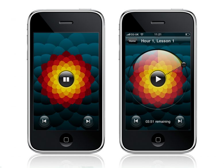
I designed the iPhone app version of a language course called the Michel Thomas Method, produced by BERG for Hodder Education.
Working with the rest of the BERG crew, I looked after the information architecture, designed the user interface, led art direction and and produced all the graphics, working alongside the mighty Nick Ludlam, who built the software.

The main playback interface was designed to be an immersive, almost hypnotic experience which complements – celebrates, even – Michel Thomas’ idiosyncratic teaching style. Here’s a little clip of it in action:
I’ve written a more detailed blog post on the project for BERG, where you can read a bit more about our approach and working methods behind the scenes.

