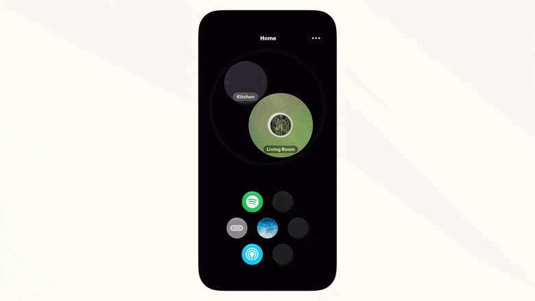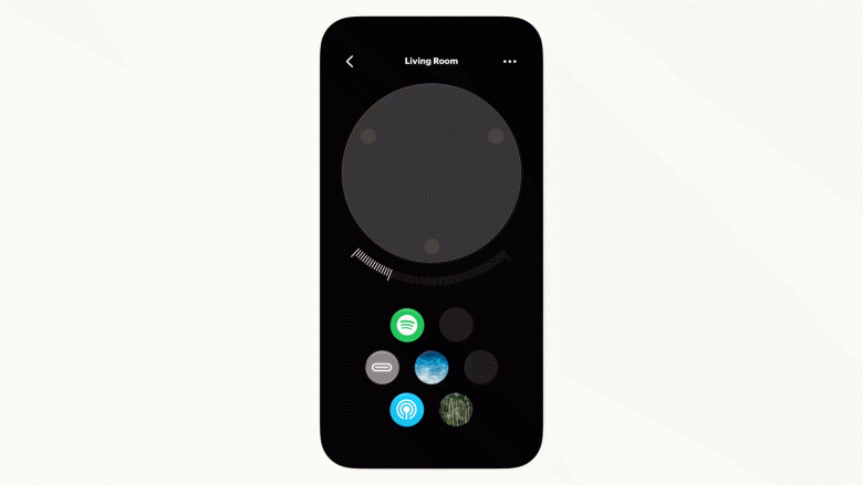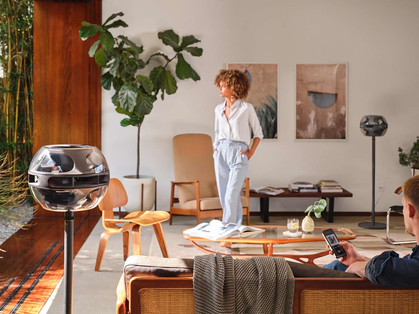
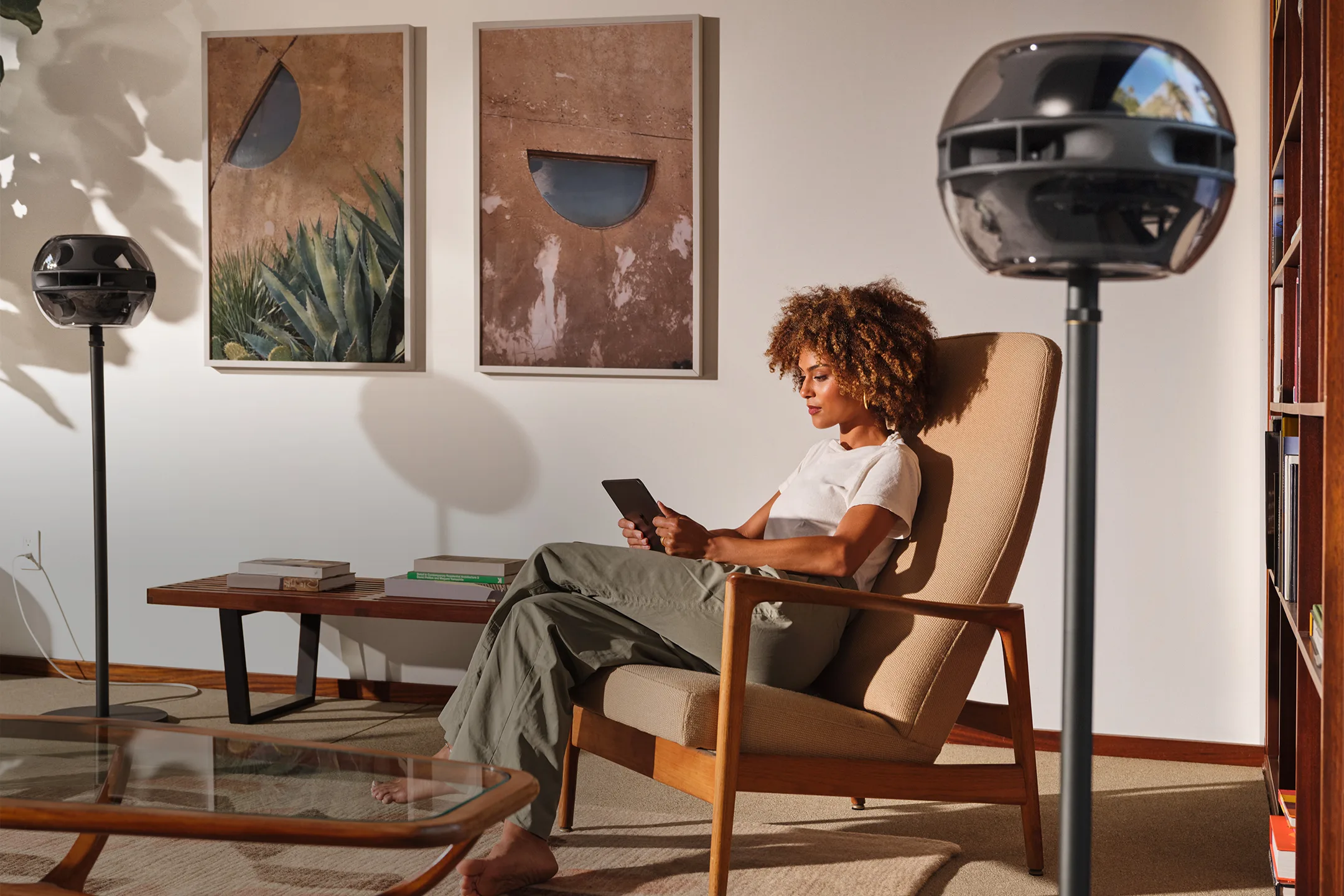
Syng is a Los Angeles-based audio startup founded by some fellow ex-Apple buddies. They’re working on a range of directionless speakers that let you position sound around you, without the need for a fixed sweet spot. I helped them design their control software.


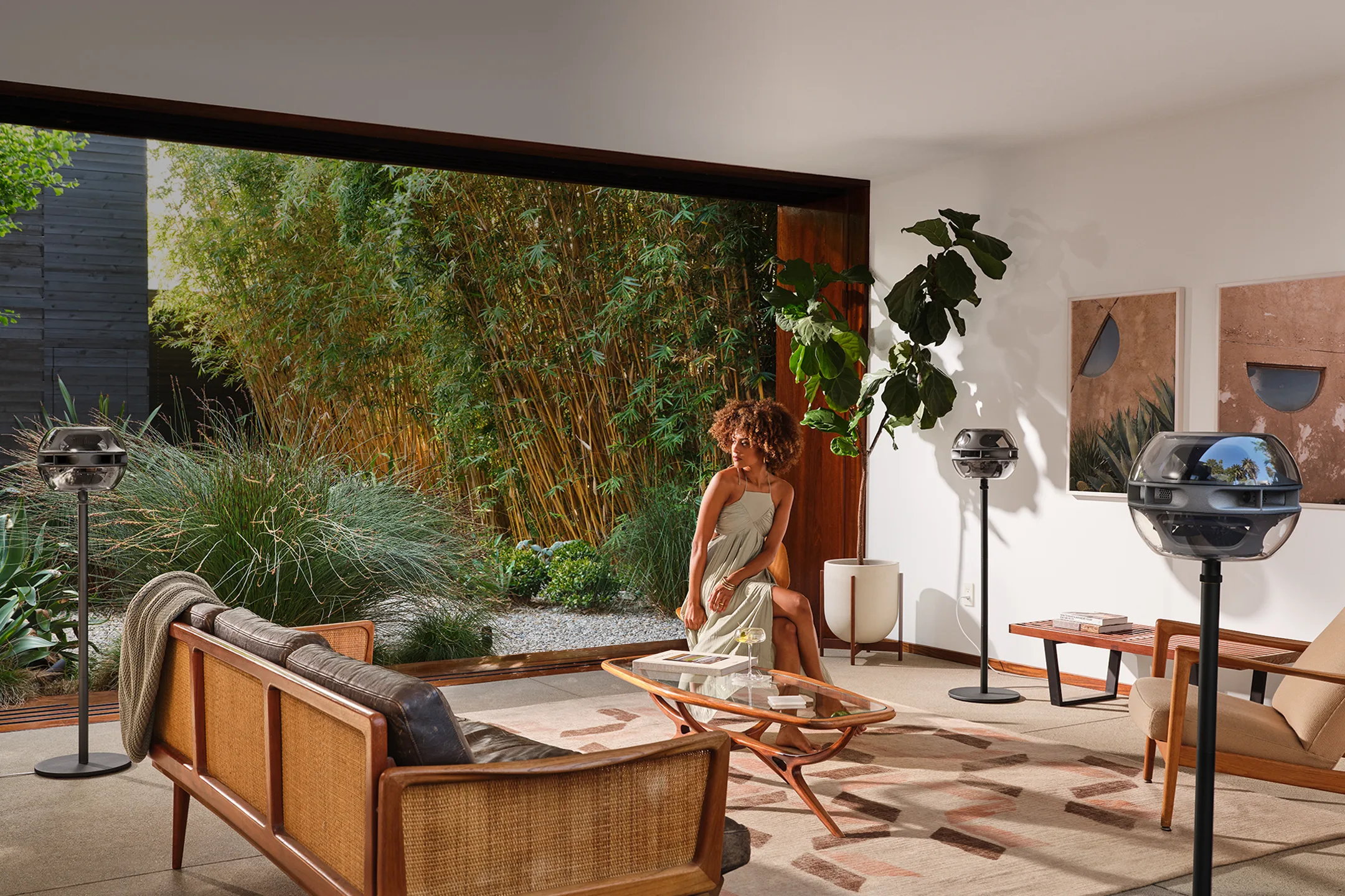
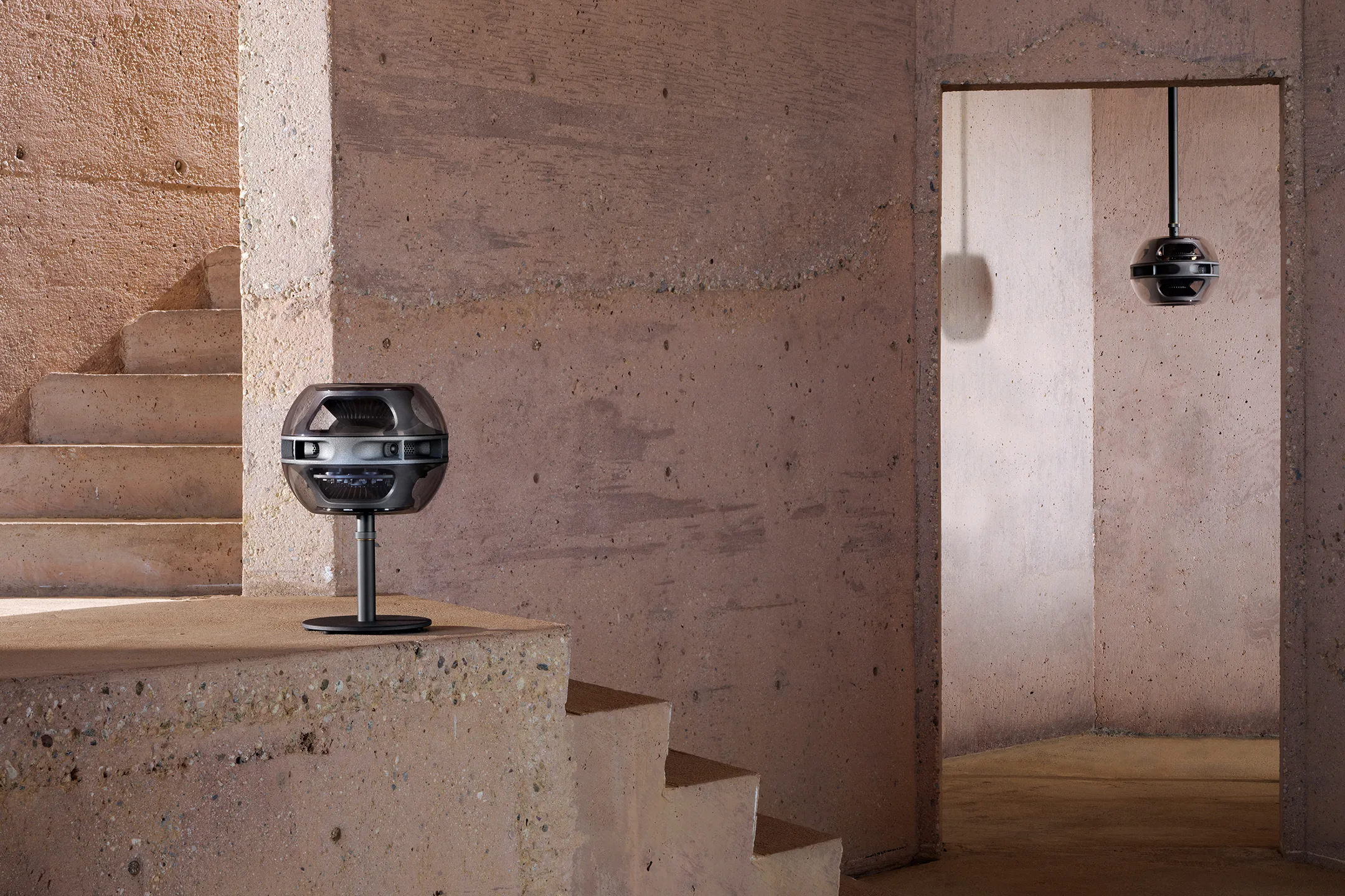
Designing Syng’s control software
In the Syng app, you see an overhead view of your room, and you can position sound sources (such as a streamed song, podcast, or input from your turntable) by dragging them around. This capability leads to all sorts of interesting stuff – from simple utilities, like being able to direct sound away from a phone conversation or sleeping kid, through to new possibilities for music and media.
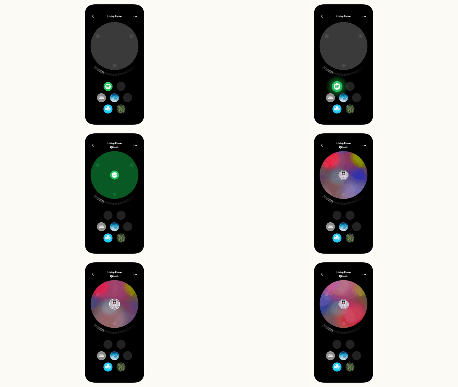
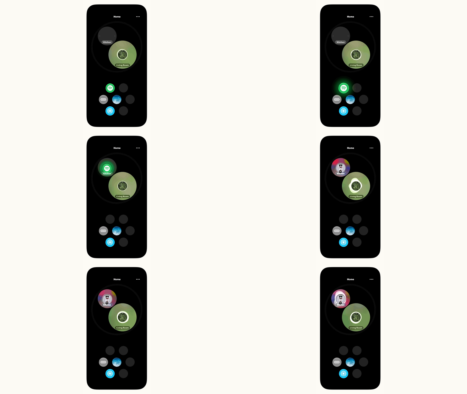

Early UI prototypes
How might someone use a speaker system like this? How do we orient ourselves in a room and know where we’re putting a sound? This is pretty uncharted territory for consumer electronics, but there are decades of knowledge from music, sound art and professional tools we can draw from. Cue lots of small, exploratory sketch prototypes to try and figure it out.
This was one of the very first Unity sketches I made, showing a simple overhead room view. My hunch from the outset was that video game map conventions would end up being way more useful than bog-standard music control UIs.
This one extends the drag and drop UI idea over multiple floors, across multiple buildings. Could we make it robust enough to handle different physical layouts and spatial zoning?
This Unity sketch explored what might happen if we had indoor wayfinding. Prodding the UI thinking in different directions like this helped force us to first figure out how to graphically describe living spaces – not easy! – before figuring out how to pour sound into them.
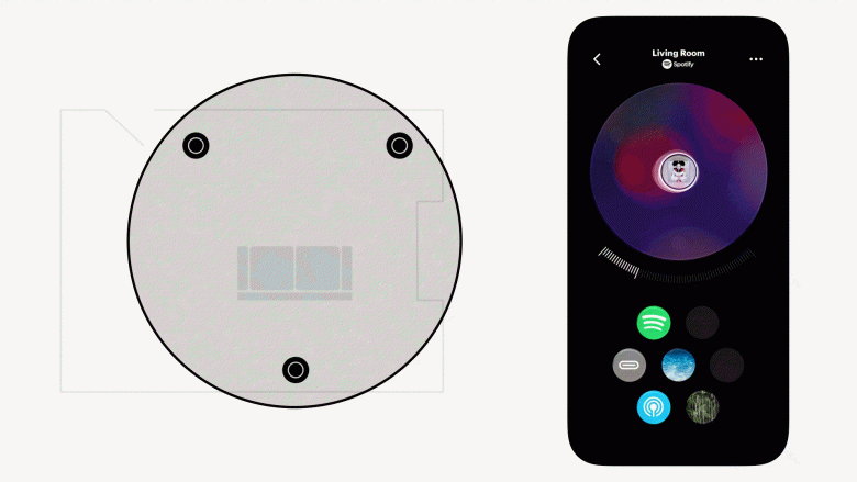
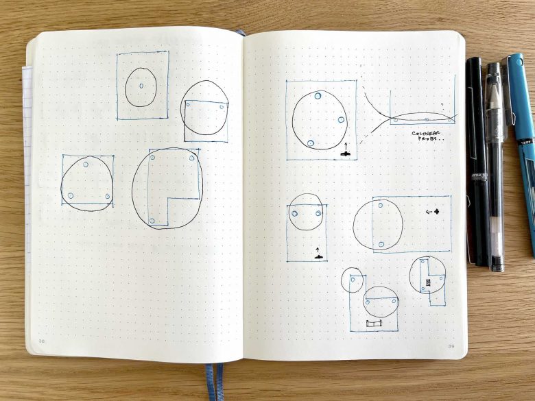
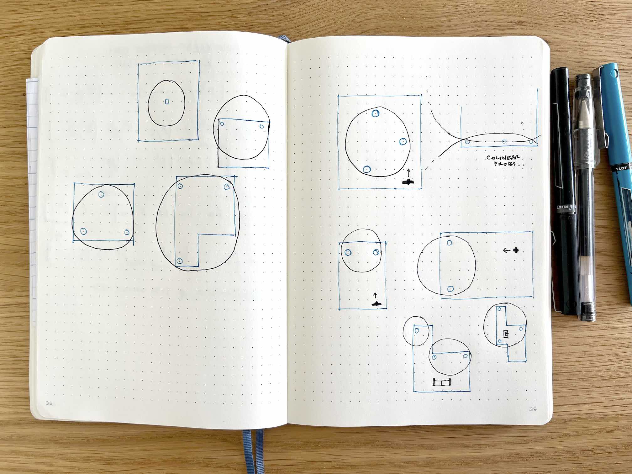
We spent ages arguing about the best mapping approach – should it be physical or schematic? Given the constraints (and rightful privacy concerns) around indoor mapping, we opted for a hybrid approach, with circular zones displayed around and between the speakers. Our bet was that you need some physical orientation during setup, but with regular use over time, a schematic map is probably more useful. We’ll see if that bet pays off…
I sketched this one in Swift (with a side order of LibPd) to help us think about managing and mixing several sounds simultaneously. This one established the broad strokes of the UI you see in the app today.
This one extended the map to multiple rooms, adding a Powers of Ten-style zoom, and establishing the basic architecture you see in the app today. Zoomy map interfaces are perfect for stuff like this.
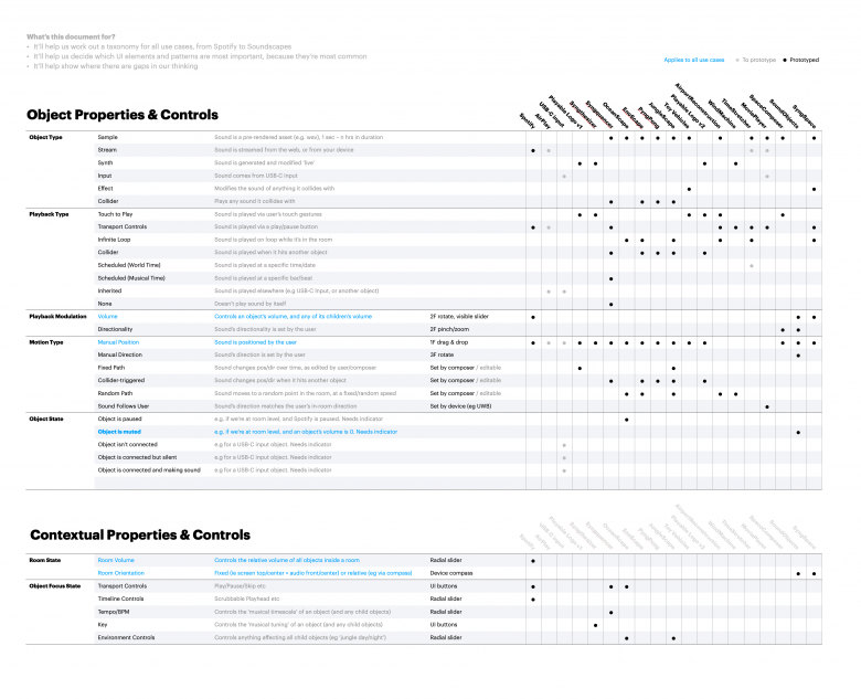
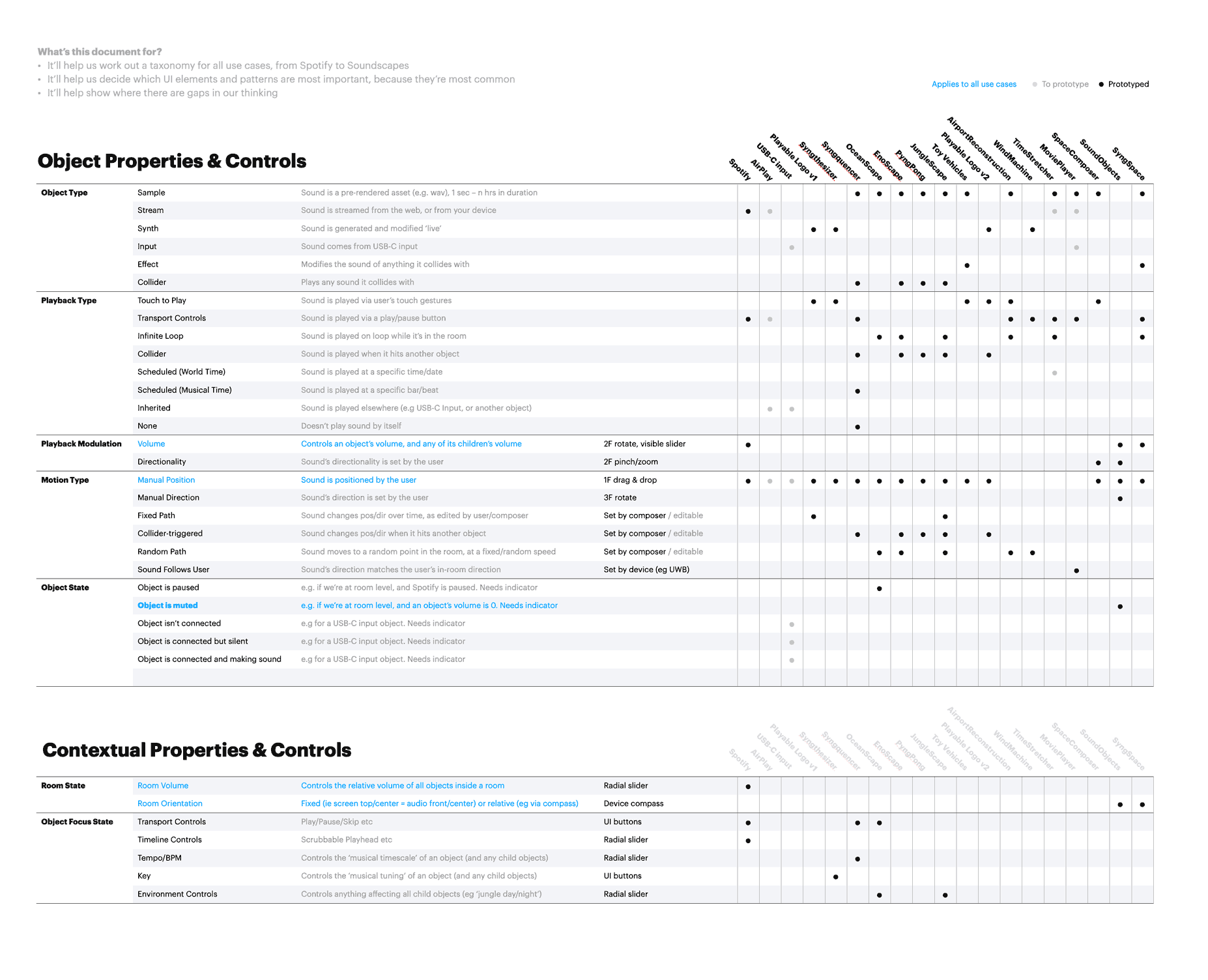
As we built more and more prototypes, we began to see the shape of a UI pattern language and taxonomy emerge. I made little charts like this to capture and describe all the work. This bottom-up, map-it-as-we-go approach has a few benefits, I think – it biases us toward learning by making actual things, rather than presentations about things; it forces us to describe things precisely; it reveals blind spots (i.e. opportunities for more prototypes), and it helps us keep track of what we’re doing.
Way, way more to show…
As we fleshed out the basics of the UI, our discussions hovered toward the broader cultural questions these prototypes poked at. If we decouple surround sound from film, TV and games, and play around with it on its own terms, what else might we enjoy doing with it? Hopefully I can share more soon on that…
